
Digital Marketing
·
April 10, 2026
How SaaS Companies Handle Billing Disputes & Chargebacks
Learn how SaaS billing disputes happen, what triggers chargebacks, and how both sides can resolve them faster.
Turn messy CRM data into reliable revenue insights with HubSpot dashboards, custom reports, workflows, and integrations for pipeline, MRR/NRR, and forecasting.
Revenue Operations teams often struggle with messy data, time-consuming manual reports, and misaligned metrics across departments. HubSpot simplifies these challenges by centralizing revenue data and offering real-time insights into pipelines, forecasts, and risks. This guide covers how to set up HubSpot for accurate reporting, create custom metrics, automate alerts, and integrate external data for deeper analytics. Key takeaways include:
With the right setup, HubSpot transforms raw CRM data into actionable insights, helping teams make informed decisions faster.

HubSpot Revenue Operations Reporting Setup: 5-Step Implementation Framework
To get meaningful insights from HubSpot reports, you need to start with a well-organized setup. Your data structure should align with how your business operates. Without this foundation, your reports could end up showing incomplete or misleading numbers.
The process begins by creating consistent data structures across three key areas: lifecycle stages, object associations, and pipelines. This structure helps automate reporting and ensures accuracy. Once the foundation is in place, configure lifecycle stages and object associations to reflect your business workflows.
Lifecycle stages help classify contacts and companies based on where they are in your sales and marketing funnel. While HubSpot provides default stages, Super Admins have the flexibility to create custom stages tailored to your business model [9]. When you set up custom stages, HubSpot automatically generates calculated properties for them, making these properties available for reporting [9].
Object associations, on the other hand, link records together in a two-way relationship, enabling more comprehensive reporting across different objects [13]. For example, connecting a contact to a company and linking both to a deal provides a complete view of your sales process. If you have a Professional or Enterprise subscription, you can use association labels to define specific roles, such as "Decision Maker" or "Influencer" [13]. These labels add an extra layer of detail, helping you identify key players in your deals.
If you're currently using a custom property to track lifecycle stages, it’s worth migrating that data to HubSpot’s default Lifecycle stage property. This switch unlocks automation and reporting features that custom properties can’t offer [9][11]. You can also enable automatic updates to sync a contact’s lifecycle stage with their associated company’s stage, maintaining consistency without manual effort [9].
Once your lifecycle stages are in order, the next step is to customize your pipelines to reflect your revenue streams.
Pipelines provide a visual representation of how deals move through your sales process. It's important to create separate pipelines only when the stages differ between revenue streams [10][12]. For instance, new business deals might require different qualification steps compared to renewals or upsell opportunities.
Every pipeline should include two essential stages: "Closed Won" (100% probability) and "Closed Lost" (0% probability). These stages are critical for HubSpot’s sales and revenue reports to function correctly. The probabilities assigned to each stage also power weighted forecasting, which calculates realistic revenue projections by multiplying deal amounts by their stage probabilities [10][14]. When pipelines are set up correctly, forecasting becomes a reliable way to gauge performance.
To maintain data integrity, use conditional stage properties. For example, when a deal is moved to "Closed Lost", you can require the user to specify a "Closed Lost Reason" before completing the action [10]. This ensures you’re collecting valuable data for future analysis.
HubSpot’s default Sales Pipeline includes seven stages with assigned probabilities: Appointment scheduled (20%), Qualified to buy (40%), Presentation scheduled (60%), Decision maker bought-in (80%), Contract sent (90%), Closed won (100%), and Closed lost (0%) [10]. If these stages don’t align with your process, you can adjust them. Just make sure the structure remains logical and easy for your team to follow.
Once your data is organized, you can create custom reports to track crucial Revenue Operations metrics. HubSpot's Custom Report Builder allows you to analyze multiple data sources simultaneously, combining CRM objects like deals and contacts with marketing and sales activities. This feature is available for Professional and Enterprise subscriptions across Marketing, Sales, Service, Data, and Content Hubs [1][4].
When building these reports, you'll work with two key field types: Dimensions and Measures. Dimensions represent non-aggregated data, such as dates, names, or categories, and are typically displayed on the X-axis or as breakdowns. Measures, on the other hand, are quantitative values like sums, averages, or counts, which usually appear on the Y-axis [4]. Understanding how to use these fields effectively is critical for building meaningful reports.
Custom reports update automatically every two hours, but you can manually refresh them every 15 minutes for the most current data [4]. For non-table reports, keep in mind that they are limited to 1,000 unique rows of data. Applying filters can help narrow down your dataset when necessary [4]. Additionally, report data generally updates within 10–15 minutes [4].
Sales efficiency metrics highlight where deals are progressing smoothly and where bottlenecks occur. Three particularly useful reports to consider are deal velocity, lead conversion rates, and sales cycle length.
To create a Deal Velocity Report, head to the Sales Analytics tool and select "Deal velocity." This report calculates the average number of days it takes to close deals, and you can group the results by user or team [7]. Deal velocity helps you gauge how quickly revenue is flowing through your pipeline, making it easier to identify performance trends.
For tracking lead conversion rates, use the "Lead funnel" report. This report measures the time from initial contact to deal conversion and analyzes conversion rates across various lifecycle stages. It provides insight into where prospects drop off and which stages yield the best conversion rates [7].
The "Time spent in deal stage" report is another valuable tool. It shows the average time deals spend in each stage, broken down by individual reps [7]. If certain stages show extended durations, it may signal a need to address process inefficiencies.
In single-object deal reports, you can also add a "Monthly Goal" reference line through Chart Settings. This feature lets you compare actual performance against revenue targets, helping you quickly assess if your team is on track to meet their goals [17].
While sales efficiency metrics are essential, keeping an eye on revenue retention is equally important for long-term success.
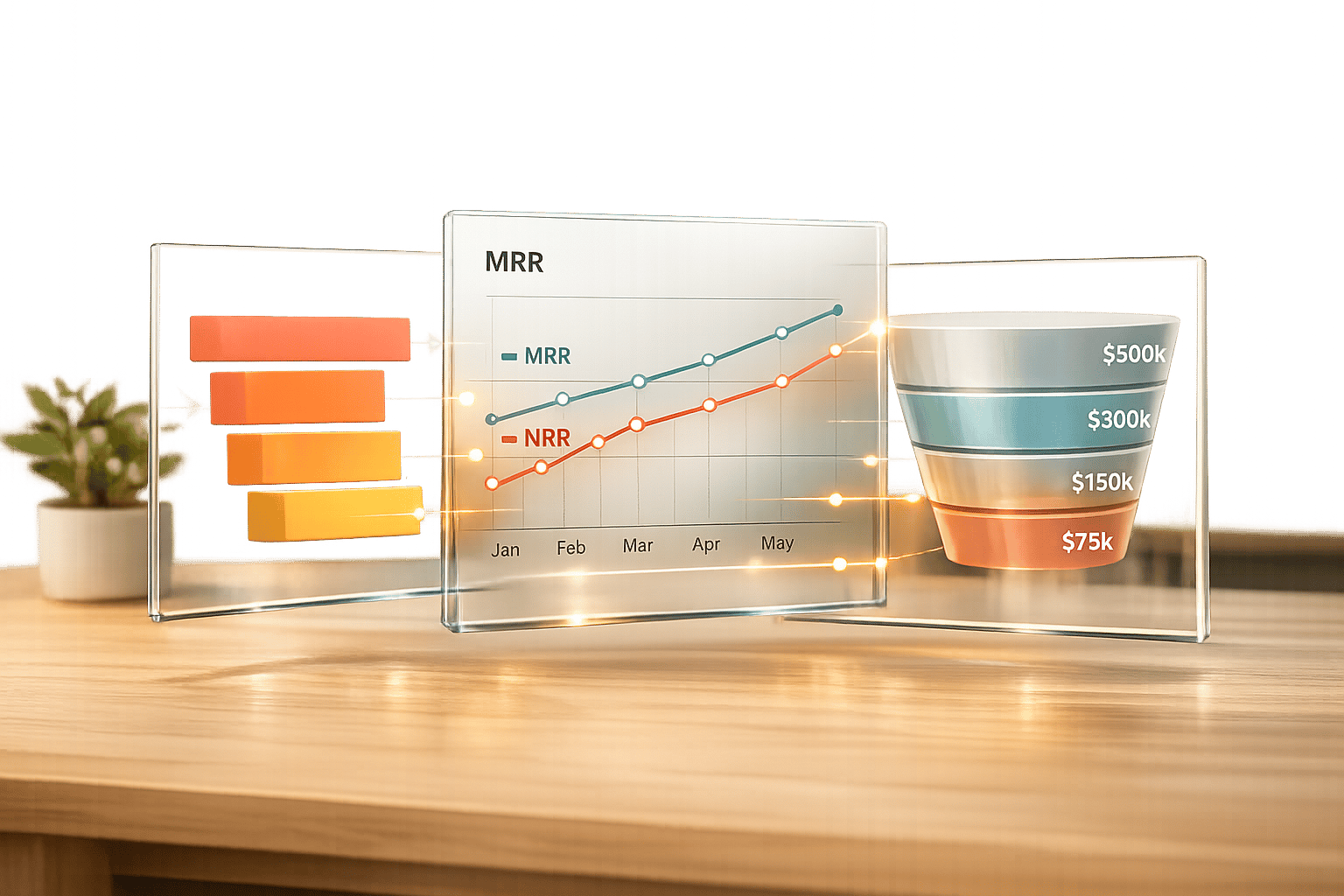
After setting up your custom reports, shift your focus to metrics that reflect long-term revenue stability. Retention and churn metrics are critical for assessing the health of your revenue streams. Revenue Operations teams should concentrate on tracking Monthly Recurring Revenue (MRR) and Net Revenue Retention (NRR), as these metrics provide a unified view for Finance, Sales, and Customer Success teams [19].
"NRR is often the first metric VCs and growth equity funds ask for because it encapsulates retention, upsell, and account health in one number." - Adam Statti, RevPartners [19]
To track MRR effectively, create a custom object in HubSpot that captures Beginning MRR and Ending MRR for every customer each month [19]. This setup acts as a monthly snapshot of a customer's recurring revenue, allowing you to pinpoint expansion or churn trends. HubSpot itself uses automated revenue snapshots to manage over $2.5 billion in annual recurring revenue [19].
Break MRR tracking into categories like Net New, Expansion, Contraction, and Churn MRR. To calculate NRR, use this formula:
(Beginning MRR + Expansion – Contraction – Churn) ÷ Beginning MRR [19].
For advanced revenue calculations that need to be used across multiple reports, consider building a dataset in Data Studio. This ensures consistency and allows you to merge external data sources, like Google Sheets or Snowflake, with HubSpot data. This approach is particularly useful for analyzing metrics like ARR, retention, and churn. Note that this functionality requires a Data Hub Professional or Enterprise subscription [15][18].
Top-performing SaaS companies often aim for an NRR of 120% or higher [19]. For comparison, HubSpot reported an NRR of 102% in Q1 2026, with a historical peak of 115% [19]. To maintain accuracy, cross-check your HubSpot revenue reports with accounting tools like QuickBooks or NetSuite to address discrepancies caused by timing differences or renewal dates [19].
Once you've created your custom reports, the next step is organizing them into dashboards to give your team real-time insights into pipeline performance. To get started, head to Reporting > Dashboards and click Create dashboard. Opt for a blank layout instead of a pre-made template to allow for complete customization [2]. These dashboards are designed to transform your reports into visual tools that highlight key revenue metrics.
The best dashboards typically include 6 to 10 tiles, each focusing on metrics that drive decision-making [3]. Avoid overwhelming your team with unnecessary data. Instead, structure your dashboard to address three essential questions: What will close? What’s at risk? What’s changed since the last review? Arrange reports from left to right, starting with high-level metrics like Revenue vs. Plan, followed by more detailed operational insights such as Pipeline by Stage or Deal Velocity [2].
HubSpot dashboards automatically refresh as data updates, but you can also manually refresh reports or the entire dashboard every 15 minutes to ensure you're always working with the latest information [2][4][20]. For deal-based reports, consider adding Goal reference lines through Chart Settings. These lines provide a clear comparison of current performance against monthly or quarterly targets [17].
Your dashboard should also include reports that help uncover friction points in the sales process. For example, the "Time Spent in Deal Stage" report shows how long deals remain in each stage of the pipeline, broken down by individual reps [7]. If certain stages show extended durations, you've likely found a bottleneck that needs attention.
Another helpful addition is the "Deal Pipeline Waterfall" report. This visual tracks revenue movement over time, categorizing changes as Created, Pushed, Pulled, Increased, Decreased, Lost, or Won [7]. It’s an excellent tool for understanding why your forecast has shifted between review periods.
| Report Type | Purpose for Pipeline Visibility | Key Metrics Tracked |
|---|---|---|
| Deal Velocity | Evaluates sales cycle efficiency | Average days to close by rep or team [7] |
| Time in Deal Stage | Identifies bottlenecks in the process | Average duration in each pipeline stage [7] |
| Pipeline Waterfall | Monitors revenue fluctuations | Net changes: pushed, pulled, or decreased deals [7] |
| Deal Forecast | Gauges near-term revenue confidence | Forecasted revenue by stage probability [6] |
For a more proactive approach, create a custom "Deal Risk" report. Use formulas that combine factors like Days Without Activity and Push Count (how often a close date has been moved) to flag high-risk opportunities [7]. This allows your team to intervene before it’s too late.
Once bottlenecks are identified, refine your dashboard by segmenting data to uncover deeper insights.
After identifying problem areas, you can fine-tune your dashboard using filters to focus on specific data. Dashboard-level filters allow you to segment data across all reports at once, without the need to adjust each report individually. Use the Quick Filters feature to pin up to five frequently used properties - such as Deal Owner, Region, or Pipeline - at the top of your dashboard [21]. This makes it easy for different users to view data through their own lens.
Dynamic Quick Filters take this a step further by analyzing your dashboard's content and automatically grouping relevant properties, like "Owners" or "Date ranges", which adjust based on the reports included [21]. For example, if you want to analyze revenue streams, the "Pipeline" filter can help you isolate data for New Business versus Renewals [6][20].
For team performance comparisons, apply filters to reports like Deal Leaderboards or Deal Forecast by Owner. Use the "HubSpot Team" filter to see how different regions or departments are performing against their quotas [6]. Additionally, you can set the "Frequency" option at the dashboard level to standardize timeframes across all reports - Daily, Weekly, or Monthly [21].
Keep in mind that dashboard-level filters use AND logic with existing report filters. If both the dashboard and a report filter by the same property (e.g., "Date"), the dashboard filter will take precedence [21]. To protect your dashboard’s structure, you can assign "View-only" permissions to executives, ensuring they have access to real-time insights without altering the underlying reports [2][3].
Take your revenue insights to the next level by expanding HubSpot's capabilities with integrated analytics. By connecting external data sources, you can close gaps in HubSpot’s native reporting. For Revenue Operations teams, this can be a game-changer, helping answer complex questions like "What’s our actual CAC by channel?" or "Which customers are showing signs of churn based on product engagement?"
HubSpot’s Data Hub (previously called Operations Hub) allows you to sync data between HubSpot and external platforms, either one-way or two-way [22]. It uses an internal index that tracks record changes every 5 minutes and automatically recovers any dropped or failed API calls. This ensures your data stays accurate before the continuous incremental sync kicks in [22].
With Data Studio, you can consolidate external data sources alongside HubSpot data [15][24]. For instance, you could combine Stripe revenue data with HubSpot deals to create "Forecast vs. Actual" reports, letting you compare predicted revenue to actual collections [26]. By selecting the right join types, you can seamlessly merge external datasets with HubSpot records [15][24].
Once your datasets are set up, the Enrichment feature allows you to fill in missing details or validate existing information by mapping external properties to HubSpot columns [15]. You can even embed custom report cards right onto Contact or Company record pages, giving sales teams instant access to enriched data. Additionally, you can monitor the health of your data syncs through the "CRM syncs" tab in settings [16][22]. This integration process ensures your team has the most comprehensive and actionable contact insights.
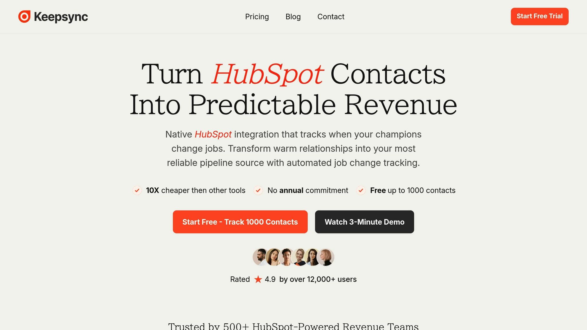
KeepSync integrates directly with HubSpot, providing real-time job change alerts with 94% accuracy by pulling data from over 30 sources. These alerts are delivered through Slack, email, or HubSpot, enriching your workflows and custom reports.
To set up KeepSync, start by selecting Contacts as your primary data source and KeepSync as the secondary source in Data Studio. Use a match key, such as Email Address or Contact ID, to establish the join [15]. This data can then be used to create a "Lead Readiness Score" in the formula builder, combining HubSpot engagement metrics with KeepSync’s verified contact enrichment [15]. For automated follow-ups, use the "Use in > Workflow" feature to trigger outreach sequences as soon as a job change is detected [23][25]. This approach turns outdated leads into fresh opportunities.
KeepSync alerts can also enhance your custom reports and dashboards, helping you stay proactive in managing your sales pipeline.
Dashboards are great for real-time insights, but automated workflows take things to the next level by actively monitoring your pipeline. With workflows, HubSpot becomes more than just a tool - it acts like a watchful assistant, flagging issues before they can hurt your revenue. Instead of wasting time manually checking dashboards every morning, you can set up workflows to monitor metrics 24/7 and send alerts when something needs attention. This approach can save teams 10 to 20 hours a week by cutting out manual data collection and spreadsheet tasks [27].
Pair these workflows with custom formula metrics to keep an eye on key performance indicators. For instance, you could create a "Deal Age Days at Risk" formula to track how long deals linger in each stage [7]. If a deal exceeds your target velocity by 20%, an alert can be sent via Slack or email [27][7]. This proactive system ensures you’re always ahead of potential problems.
Some metrics require immediate attention. One example is deal stagnation - if a deal hasn’t seen activity for over 14 days, it’s a sign something’s wrong [7]. Another red flag is when a deal’s close date is pushed back three or more times, which can throw off your forecast [7].
To set up these alerts, use filter-based workflows in HubSpot, available for Professional and Enterprise users [29]. Configure enrollment triggers to track properties like "Time spent in deal stage" or "Deal push count." For ongoing monitoring, enable re-enrollment so alerts trigger every time conditions are met [29].
By combining custom metrics with these workflows, you can ensure your data stays accurate and actionable. For example, HubSpot suggests creating a "Weighted Risk Score." Add 10 points if a deal has no activity for 14 days and 20 points if it’s been pushed back three times or more [7]. When the score exceeds your threshold, the workflow can automatically assign a task to the deal owner or notify leadership.
| Metric to Monitor | HubSpot Property | Recommended Alert Trigger |
|---|---|---|
| Long Deal Duration | Time in Stage | When "Days in Stage" exceeds average velocity by 20% |
| Pipeline Stagnation | Last Activity Date | When no activity has occurred for over 14 days |
| Forecast Instability | Deal Push Count | When the push count reaches 3 or more |
| Revenue Leakage | Deal Amount | When the deal amount drops by more than 10% |
Automated alerts are just the beginning. To fine-tune your strategies, leverage A/B testing alongside advanced analytics. HubSpot's attribution reporting pinpoints which touchpoints and channels drive conversions [8][28]. Custom reports refresh automatically every two hours - or every 15 minutes if you need updates quickly [4].
You can also use datasets as enrollment triggers for workflows that run on a daily, weekly, or monthly basis [23]. For example, identify customers showing signs of churn based on engagement scores and test different retention strategies for each segment [23][15]. HubSpot stores workflow action logs for 90 days, giving you a historical view to spot trends and make data-driven adjustments [29].
With detailed setups and custom reporting, HubSpot's tools create a system that delivers clear, actionable insights. For Revenue Operations teams, this means replacing chaos with clarity. HubSpot provides a centralized, real-time view of pipeline health, closed revenue, and forecast performance, ensuring teams stay on top of their goals [2].
"A well-built HubSpot revenue dashboard replaces spreadsheets with clarity." – Hubjoy [2]
By leveraging HubSpot's native features alongside smart integrations, like lifecycle funnel dashboards to identify revenue leaks, attribution reporting to pinpoint conversion channels, and KeepSync's real-time job change alerts, static data is transformed into actionable insights [5][8][28].
Data-driven strategies go beyond just insights - they drive profitability. Companies that use these strategies are six times more likely to see year-over-year profits [31]. Success hinges on maintaining clean data, setting up automated alerts for critical metrics, and focusing dashboards on decision-making essentials [2]. Regularly reviewing KPIs each month and conducting quarterly data quality audits ensure your reports remain accurate and effective [2].
HubSpot reporting turns raw CRM data into measurable business outcomes [30]. When paired with strategic integrations and a strong commitment to data accuracy, it becomes a system that consistently drives revenue through informed, data-driven actions.
To build trust in HubSpot revenue reports, start by standardizing lifecycle stage definitions, deal stages, and revenue data. It's also essential to double-check the accuracy of your data and ensure all systems are aligned. These foundational steps are key to generating consistent and reliable insights that you can act on with confidence.
To access custom reports, datasets, and workflows in HubSpot, you'll need an Enterprise subscription. These advanced tools are part of the Enterprise tier, which is tailored for businesses requiring more advanced reporting capabilities and streamlined operations.
To connect Stripe or QuickBooks data with HubSpot for accurate forecast vs. actual reporting, set up automation tools that allow live data syncing and scheduled updates. This approach keeps your reports current by merging HubSpot pipeline data with financial information seamlessly. By configuring automated workflows, scheduling updates, and building custom dashboards, you can analyze the integrated data effectively - no manual exports required.